Scaling peer-to-peer payments to $1M monthly As Founding UX Designer
We built Byte to connect people through simple, reliable payments, solving the banking downtime crisis in Nigeria.
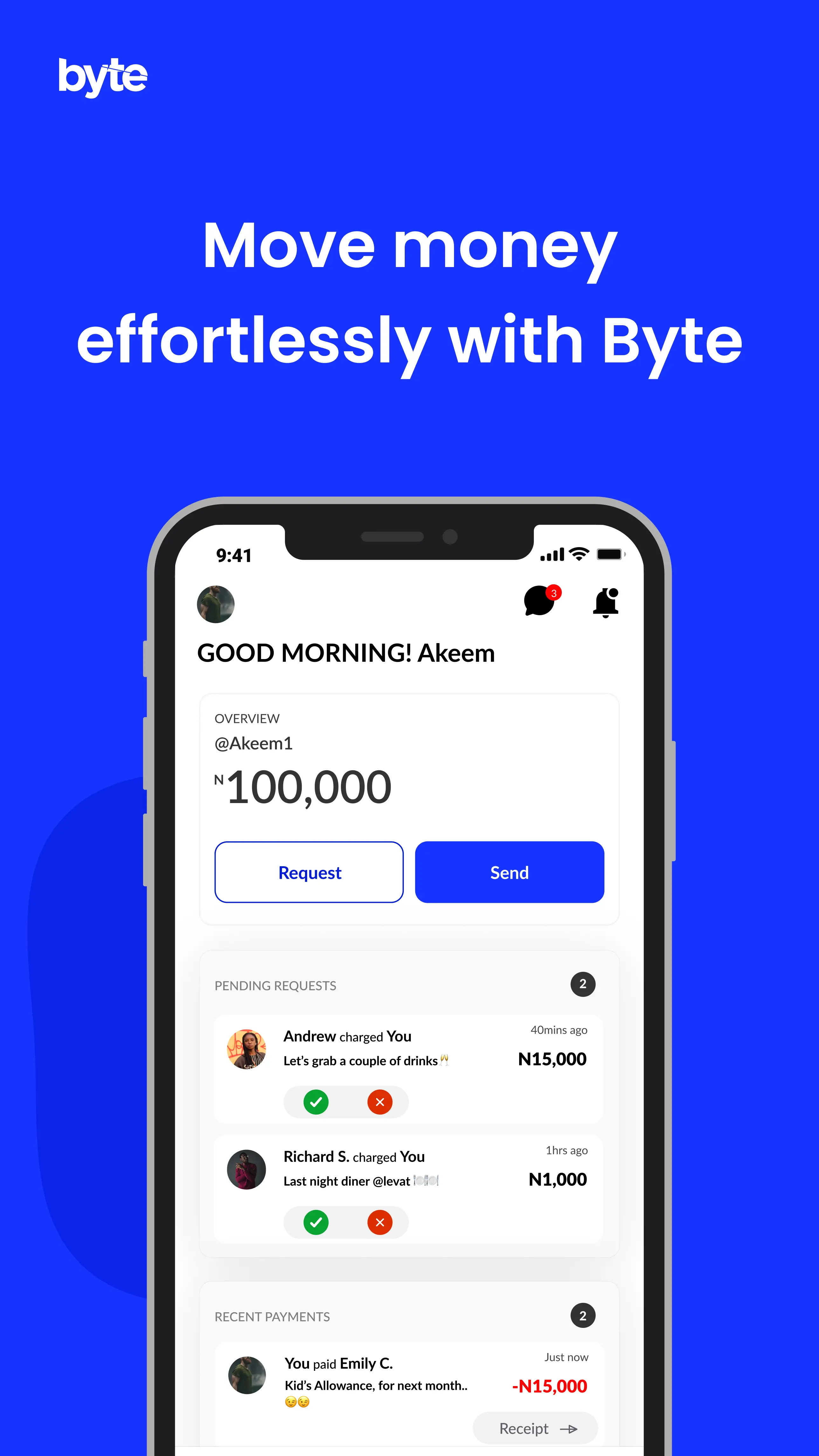
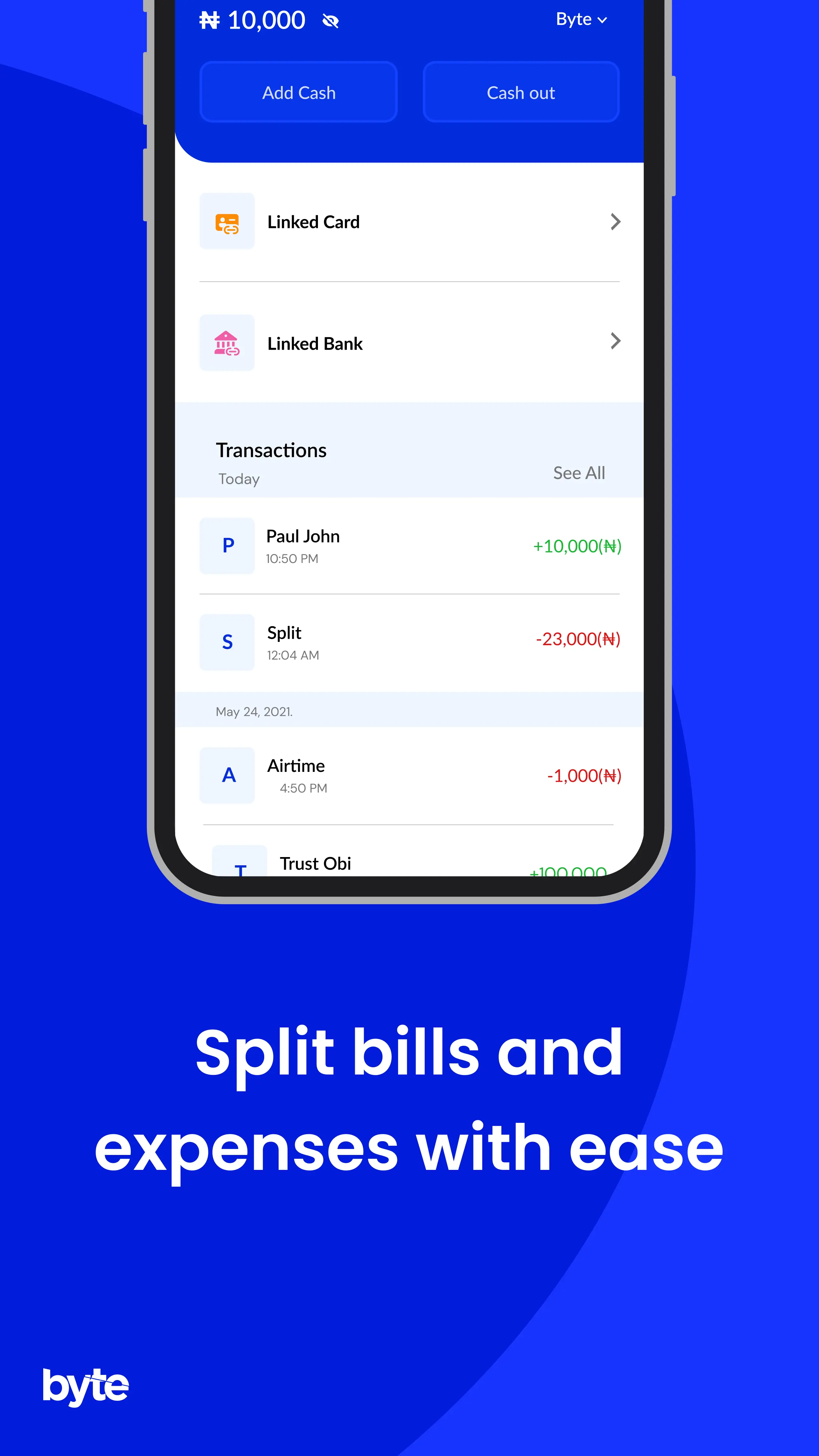
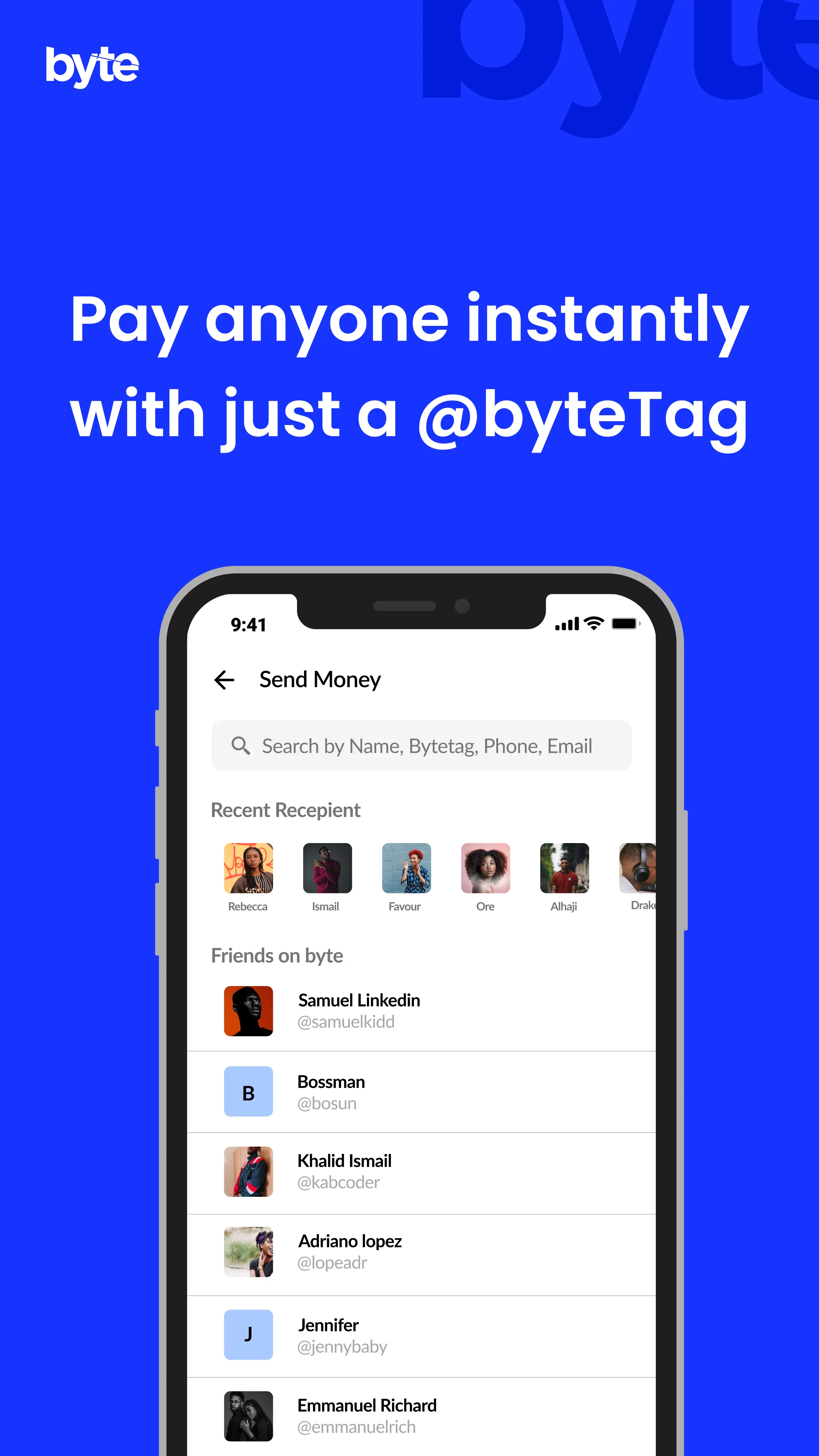
Introduction
Mobile payments in Nigeria have grown fast, but using them has not always felt simple. During lockdown, more people relied on their phones to send and receive money, often for the first time. Many of the existing apps were hard to understand, slow, or built for experts rather than everyday users.
Byte was created to solve this gap. The goal was to make sending and receiving money feel as easy as sending a message. This case study focuses on how we designed a clear, fast, and trustworthy payment experience for people who needed it most.
Problem Definition
Payment downtime across Nigerian banks has increased by over 30 percent. In practice, this means many peer to peer transfers fail, get delayed, or arrive without clear confirmation. For users, this creates stress, loss of trust, and extra effort chasing support or reversing failed payments.
People want payments that are fast, reliable, and easy to understand. Instead, they face unclear errors, long delays, and poor communication when something goes wrong.
The key questions we needed to answer were:
- How can we make peer to peer payments feel more reliable and transparent?
- How can we reduce the impact of bank downtime on everyday users?
- How can we design a payment experience people actually enjoy using?
Before designing solutions, we looked at the root causes:
- Limited and fragile banking infrastructure
- Interbank transfers controlled by a single central system (NIBSS)
- Poor error handling and feedback in existing apps
- Low trust caused by repeated failed transactions
This understanding shaped how we approached the product design.
Solution
Byte was designed to make peer to peer payments faster, more reliable, and easier to use. The goal was to remove the common friction people face when sending money between banks.
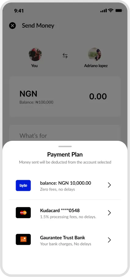
Instead of relying on bank details, Byte allows users to send money using a phone number, email address, or a unique Byte tag. Payments are funded through linked bank accounts or cards, but the transfer itself happens within Byte.
This approach helped us:
- Reduce failed and delayed transfers
- Make payments feel simple and familiar
- Lower transaction costs for users
- Create a payment experience that feels modern and easy to trust
To achieve this, we made a deliberate decision to avoid direct interbank transfers for peer payments, which are largely handled by the Nigeria Inter Bank Settlement System and are a major source of downtime.
Competitive Advantage
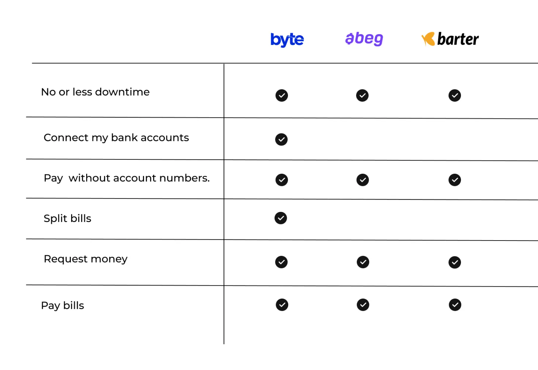
We know Byte is not the only startup in Nigeria trying to tackle the down time payment issues during this time and for us to construct a concise and solid foundation for Byte, We had to see what and who are the competitors. As at the time of this report, We only have few startups tackling same issues which are Abeg and Barter. We evaluated several features deemed vital from user surveys and identified which ones byte could capitalise on to have a leg up over other applications.
Sketches / Lo-Fi Ideation
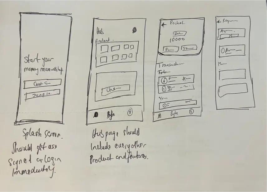
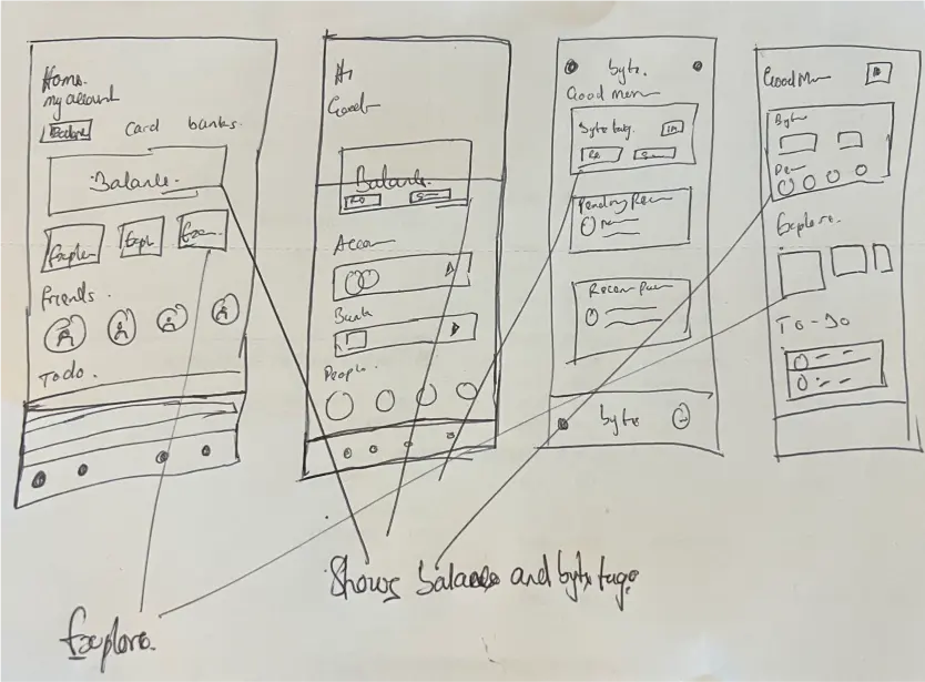
Working through our initial sketches, we realised some of the ideas and layouts that we were thinking of just wouldn't fit. Not only were we able to quickly communicate some of the ideas we had a hard time explaining to each other, but we were also able to take them and spark more discussions as well as quickly filter the good and bad ideas out..
Wireframes
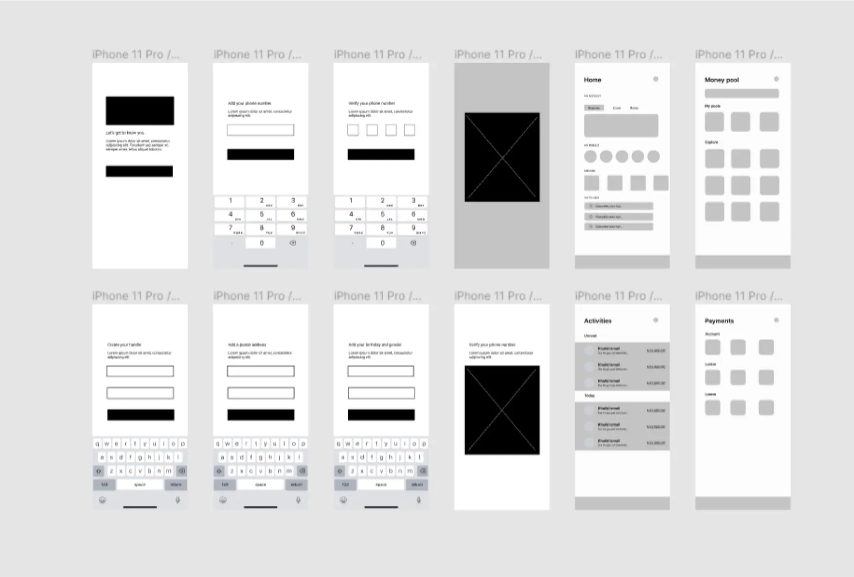
Developing the wireframes provided a clear structure for Byte's split payment features. This initial design phase helped us identify potential usability issues and refine the user flow, setting a solid foundation for the high-fidelity designs.
Key decisions
1. Designing the Transfer Flow
We knew that for Byte to succeed, the core action—moving money—had to be effortless. We explored three distinct interface directions to find the balance between speed, clarity, and trust.
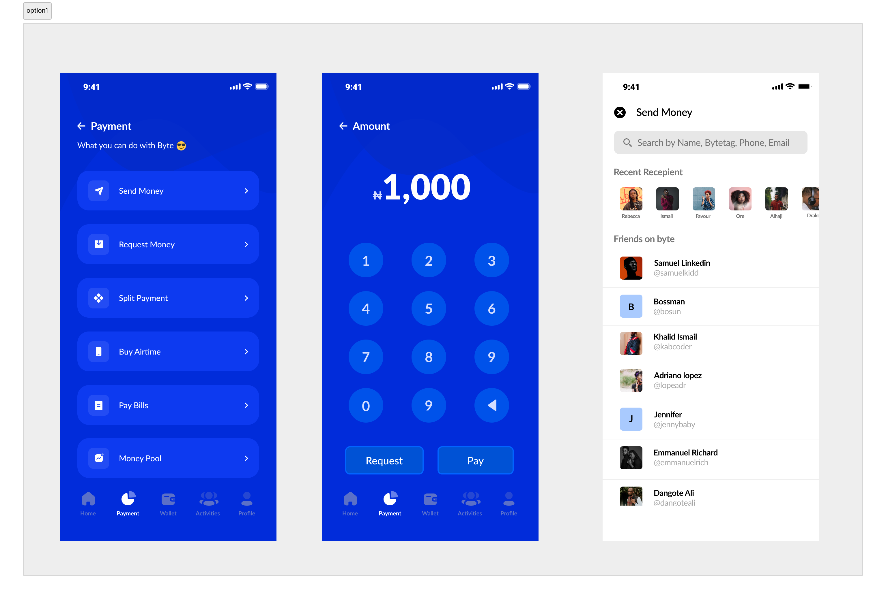
Option 1: Our first exploration focused purely on utility. We used a heavy blue background and a linear list of actions ("Send Money," "Request Money," "Pay Bills").
The Logic: We thought a clear list would help users find exactly what they needed immediately.
The Problem: While functional, it felt rigid like a traditional bank interface. It didn't feel personal or social. The heavy use of blue also made the text harder to scan quickly.
Option 2: We tried a "Super App" approach. We introduced a tabbed interface ("People," "Bills," "Business") and a prominent "Fund your wallet" section.
The Logic: We wanted to show users everything Byte could do upfront.
The Problem: This introduced too much cognitive load. The "Fund your wallet" section dominated the screen, distracting users from the primary goal of sending money. It felt cluttered and overwhelming for a user who just wanted to pay a friend quickly.
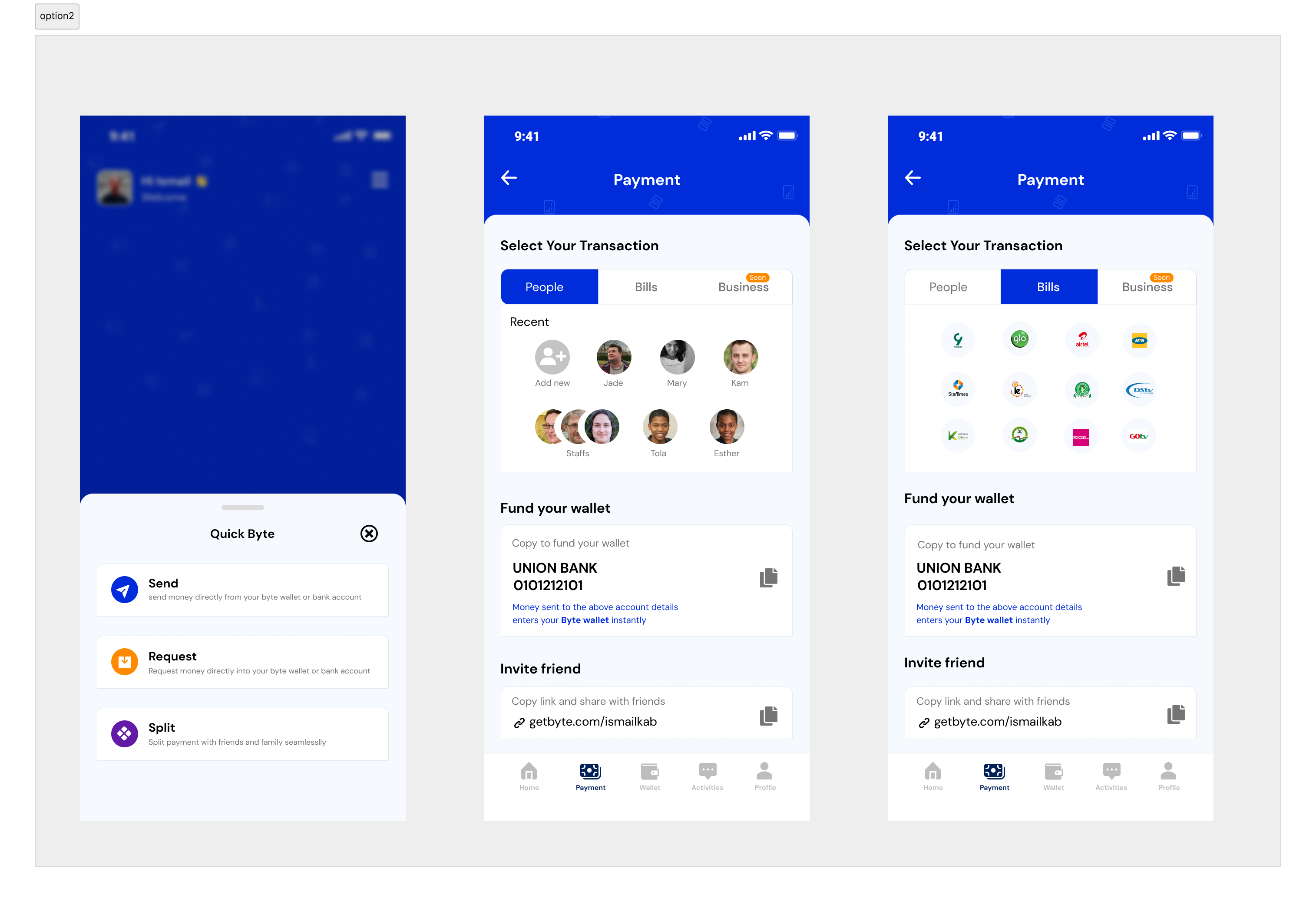
Option 3: Anchored payments directly on the home screen, making send and request actions immediately visible. Users could select a recipient, enter an amount, choose a payment plan, and confirm in a single, linear flow.
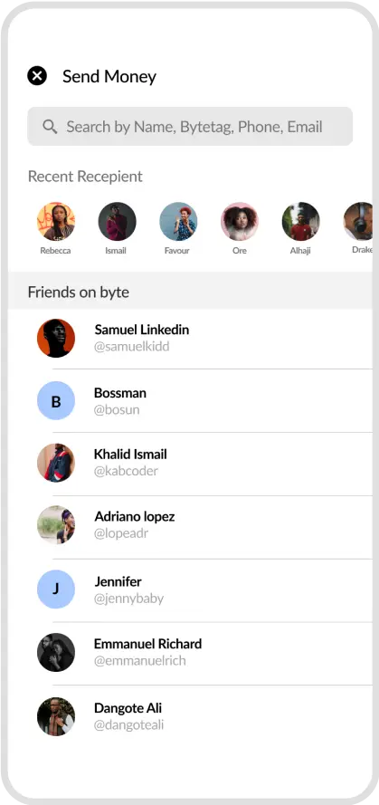
People-First Design: Instead of a list of transaction types, we highlighted the people involved. The "Recent Activity" feed mimics a chat app, making the app feel alive and social.
Clear Hierarchy: We simplified the home screen to focus on the three things that matter most: The Balance, The "Send" button, and The "Request" button.
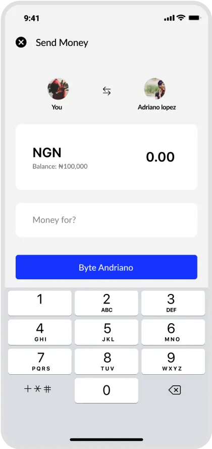
Contextual Confidence: In the transfer flow (3rd screen), we show the sender and receiver avatars side-by-side ("You" ↔ "Adriano"). This visual confirmation builds trust, reassuring the user they are paying the right person before they confirm the transaction.
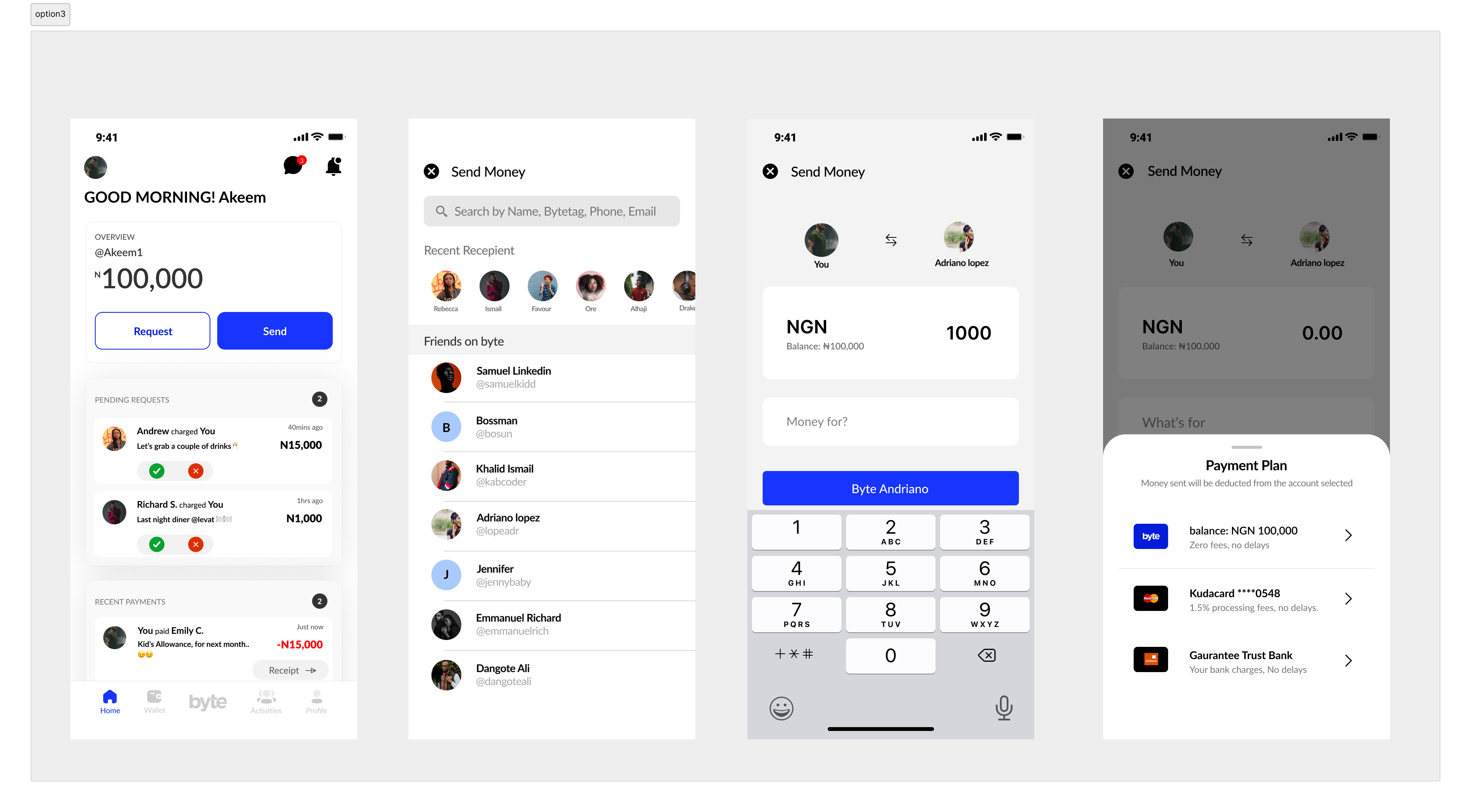
We chose Option 3 because it minimised cognitive load, reduced time to complete a transfer, and aligned with how users already think about money movement. This decision directly influenced the recipient search, amount input, and payment confirmation screens you see here, resulting in a faster, more confident peer-to-peer payment experience.
2. Designing the navigation system
The navigation bar is the main way people move around a mobile app. For Byte, it was especially important because users often open the app to do one thing quickly, send or receive money. Our challenge was to make key actions easy to reach while keeping the app calm, clear, and trustworthy.
We explored three different navigation options before deciding on the final approach.
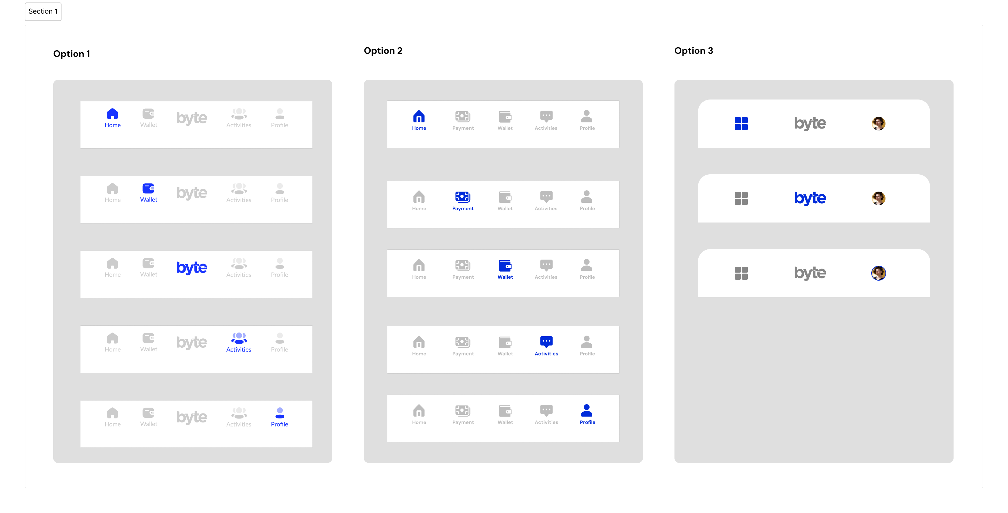
Option 1: This option used a five tab bottom navigation with clear icons, short labels, and the Byte logo placed at the centre.
Brand presence: Placing the Byte logo in the middle helped reinforce the brand every time users opened the app. It gave Byte a clear identity without getting in the way of everyday tasks and also serve as a pay quick action button.
Clear feedback: Active tabs were highlighted in blue, so users could always tell where they were. This reduced confusion and made it easier to move between screens without thinking too much. The most common actions, Home, Wallet, and Activity, were all within easy thumb reach. This mattered because many users use the app on the go or in busy environments.
Option 2: This version added a dedicated Payments tab to the navigation.
The idea: We wanted to make payments feel like the main action and encourage users to send money more often.
Clear feedback: Testing showed that users were confused by having both Payments and Wallet in the navigation. People were not sure where to go to check their balance versus sending money. The extra tab made the navigation feel busy and less clear.
Option 3: This option reduced the navigation to three items and placed extra features inside a menu.
The idea: We aimed for a cleaner, more premium look that focused strongly on the Byte name and visual style.
Clear feedback: Although it looked good, it slowed users down. Important screens like Wallet and Activity were hidden behind a menu. For a payment app, especially during quick or stressful moments like paying at a checkout, this created unnecessary steps and frustration.
Why we choose option 1
Option 1 struck the right balance. It felt modern and friendly, while still being practical. Users could reach their money and transaction history instantly, and the app remained easy to understand even for first time users. It supported fast actions without making the app feel cold or complicated.
Results and Impact
After settling on Option 1, we saw clear improvements in how people used the app. Users completed payments faster because key actions were always visible and easy to reach. Fewer people got lost or switched between tabs unnecessarily. Support requests related to navigation dropped, which suggested better understanding and confidence. Overall, the clearer structure helped build trust by making the app feel predictable, reliable, and easy to use when it mattered most.
3. Designing for trust in the contact list
In a payment app, the scariest moment is hitting "Send." Did I type the name right? Is this the right "Emmanuel"? To solve this anxiety, we needed the contact list to offer immediate visual confirmation.
We debated three ways to handle user profiles, balancing social trust against app performance.
The Options we explored:
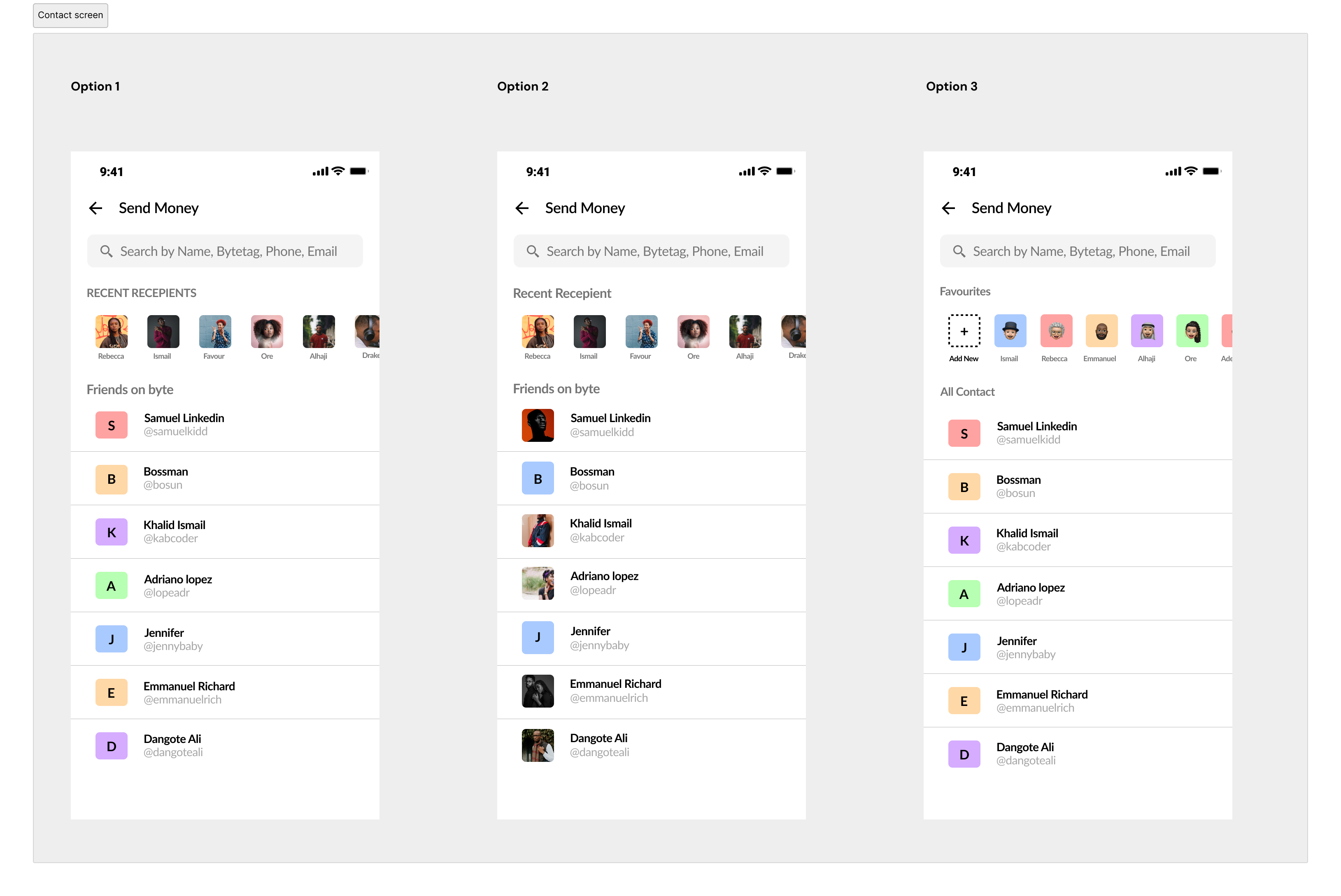
Option 1: This was the safe bet. We would show photos only for "Saved Beneficiaries" (people you pay often) and use simple initials for everyone else.
Why we scrapped it: It felt inconsistent. The list looked messy, and it didn't solve the trust problem for new or one-off payments—which is exactly when you need visual confirmation the most.
Option 3: We explored using fun, generated avatars for users without photos.
Why we scrapped it: While it looked consistent, it failed the "trust test." If I am sending 50,000 Naira to a mechanic, a cartoon avatar doesn't tell me I have the right person. It felt too playful for a financial transaction.
Option 2: The Winner We decided to pull profile photos for every single Byte user in your contact list.
Why it won: It instantly made the app feel social, like WhatsApp or Instagram. More importantly, seeing a real face eliminates the fear of sending money to the wrong person.
The Technical Challenge: Handling the "Heavy Lift"
Choosing Option 2 wasn't easy from an engineering standpoint. Loading high-resolution images for a user's entire phonebook is data-heavy and can slow down the app—especially on older Android devices common in our market.
To make this design work without killing performance, we had to solve a few backend puzzles:
Lazy Loading: We ensured images only downloaded as the user scrolled, rather than all at once.
Aggressive Caching: Once a contact's photo is loaded, it caches locally so it doesn't need to be fetched again unless they update their profile.
Thumbnail Compression: We created a pipeline to serve smaller, compressed thumbnails for the list view, only loading the full-res version if you tapped into their profile.
By solving these technical constraints, we were able to keep the experience fast while delivering the high-trust visual experience users needed.
High-Fidelity
Creating a high-fidelity version of our wireframes allowed me to identify and resolve technical issues that weren't apparent in the initial stages. This approach ensured a more polished and practical high-fidelity design for Byte's payment.
 Splash
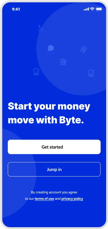 Splash
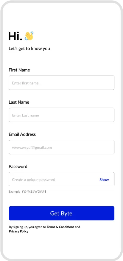 Onboarding
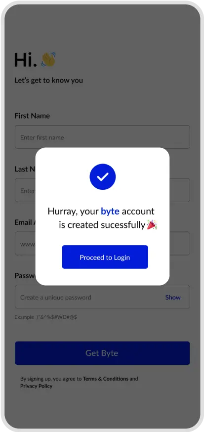 Onboarding
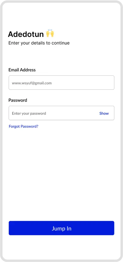 Onboarding
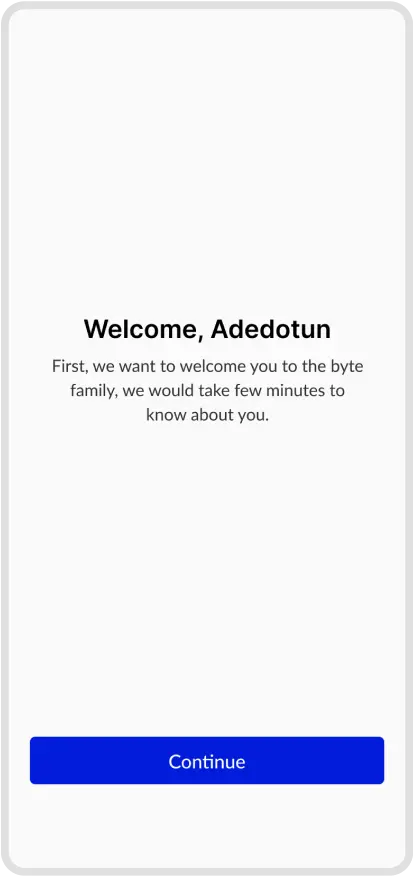 Onboarding
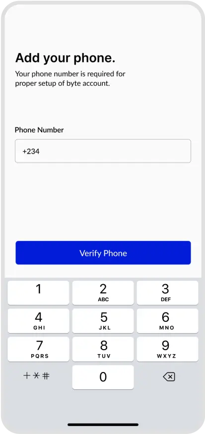 Onboarding
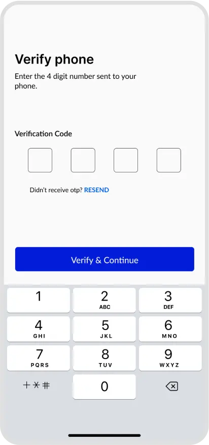 Onboarding
 Onboarding
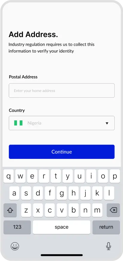 Onboarding
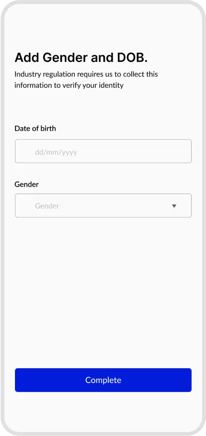 Onboarding
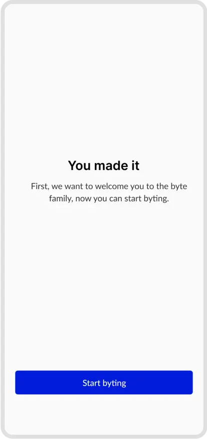 Onboarding
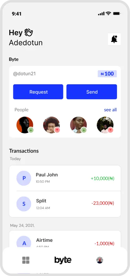 Homepage
 Contact
 Amount Screen
 Payment Option
Metrics
Byte launched in December 2021 and achieved strong early momentum in its first quarter. By Q1 2022, the platform had secured a strategic partnership with a tier one Nigerian bank, validated its payment infrastructure, and processed over $10,000 in transaction volume. During this period, more than 600 users joined the waitlist. Early qualitative feedback and usage data from this cohort were used to identify friction points in onboarding and peer to peer payments, directly informing product and UX iterations.
Throughout 2022, Byte continued to scale both its product and operations. By the end of the year, the platform had processed over $500,000 in cumulative transaction volume. The team expanded to six full time employees across product, engineering, design, and operations to support growing demand. Improvements to onboarding, KYC flows, and payment reliability contributed to steady increases in activation and repeat usage. In recognition of my impact across product delivery, user experience, and team leadership, I was awarded Employee of the Year.
In 2023, Byte entered a new growth phase. Monthly transaction volume reached approximately $1 million, with projections trending toward $3 million per month. As the product scaled, insights from transaction data, customer support logs, and user interviews highlighted the need for a more robust, flexible platform. This led to the launch of Byte 2.0, focused on enhancing performance, simplifying core payment flows, and introducing more scalable design and system foundations to support long term growth.
Related Case Studies
expenses.
View project
on Byte
View project
expenses.
View project
on Byte
View project